Am I Normal?
Every year around this time, the interwebs and Twitters are full of complaints about how (gasp!) historically bad this year's bubble is. That it happens every year should tell you something.
I'm here to set the record straight: this year's bubble is not historically bad. In fact, the teams around the at-large cut line in any given year are not bad teams at all. Let me explain with a little bit of high school math.
Most power rankings (e.g., Sagarin) and statistics (including Pomeroy's adjusted efficiencies) show that teams roughly follow a normal distribution. You may know this as a bell curve, though perhaps a slightly asymmetric one.
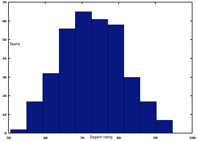
While this has several implications, two are relevant here. First, there are fewer teams at each end of the distribution. You generally hear few disagreements about which are the very best teams or the very worst teams. More importantly, as you move toward the middle of the distribution, teams are more bunched together and therefore less distinguishable.
These teams are still good teams, mind you; they are the best 50(ish) teams out of about 350 that play in the best of three NCAA divisions. They are just harder to compare to each other because a normal distribution means the difference between the 41st and 51st best teams is much smaller than the difference between the 1st and 11th best. Expanding the at-large field by three teams has slightly worsened the effect, but it is still nothing more than an inherent statistical property.
So, no, the bubble isn't full of "historically" bad teams this year or any other year for that matter.
It's just normal.